How do you help TfL explain a complex programme of works at Bank Station?
DAY IN THE LIFE OF (DITLO) & ANIMATION
Problem:
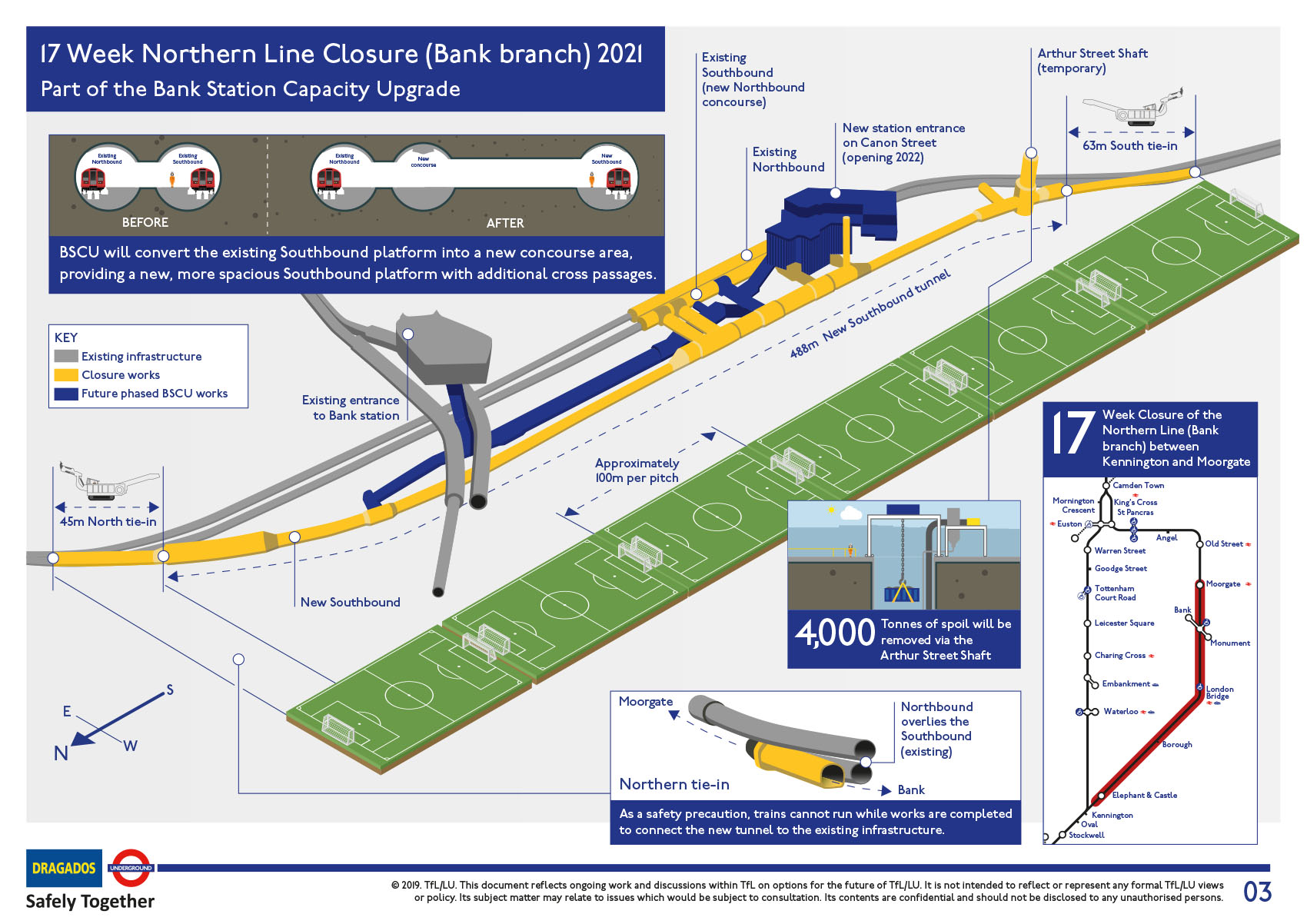
TfL has recently gone public on the line closure so that they can connect up the two ends of a new tunnel section at Bank station. This project, the ‘Bank Station Capacity Upgrade’ will deliver a 40% capacity increase at the interchange.
Visual solution:
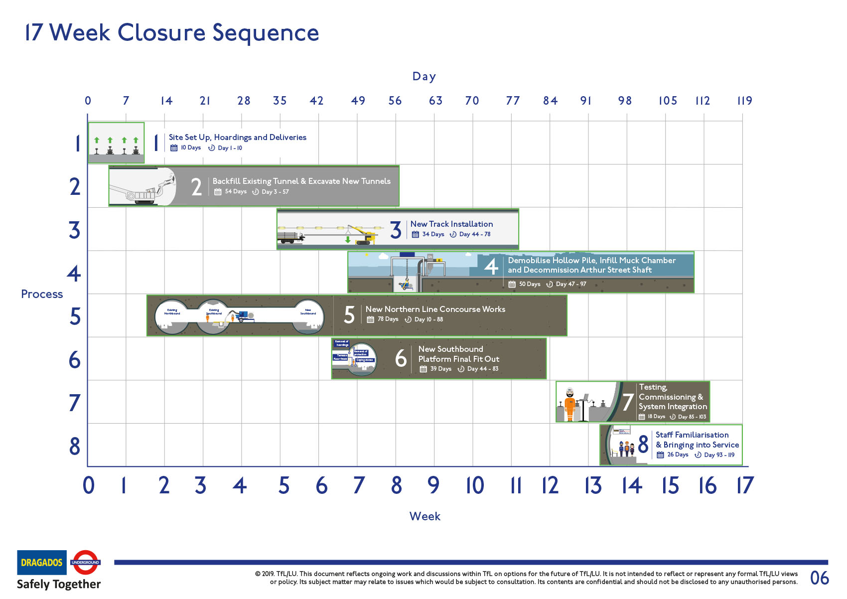
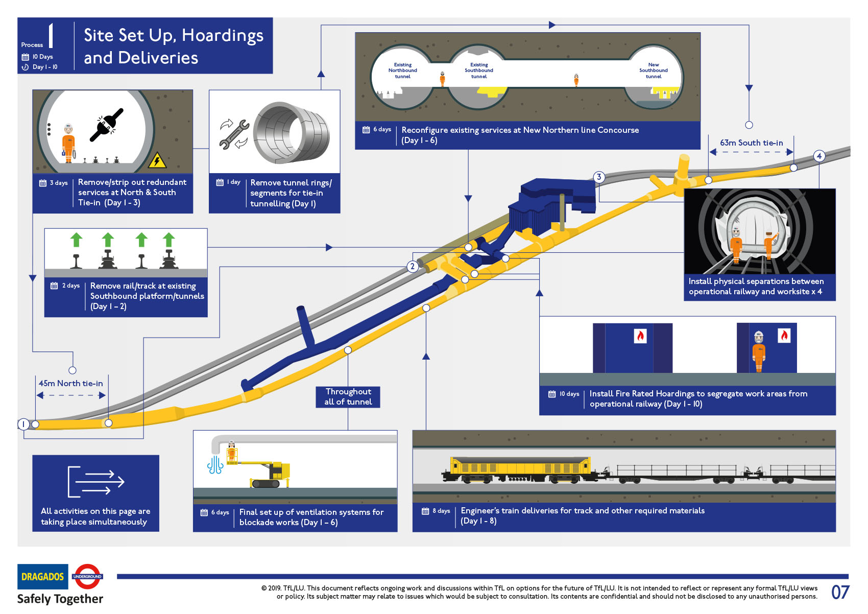
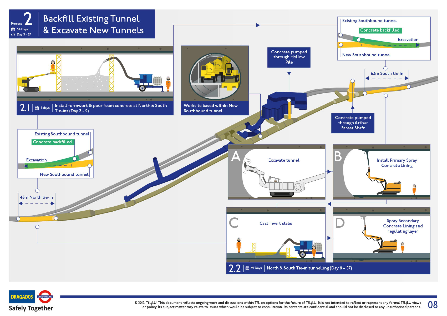
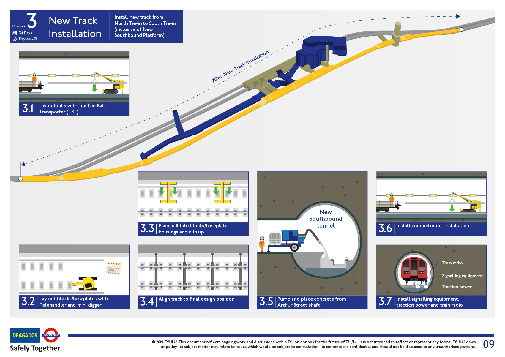
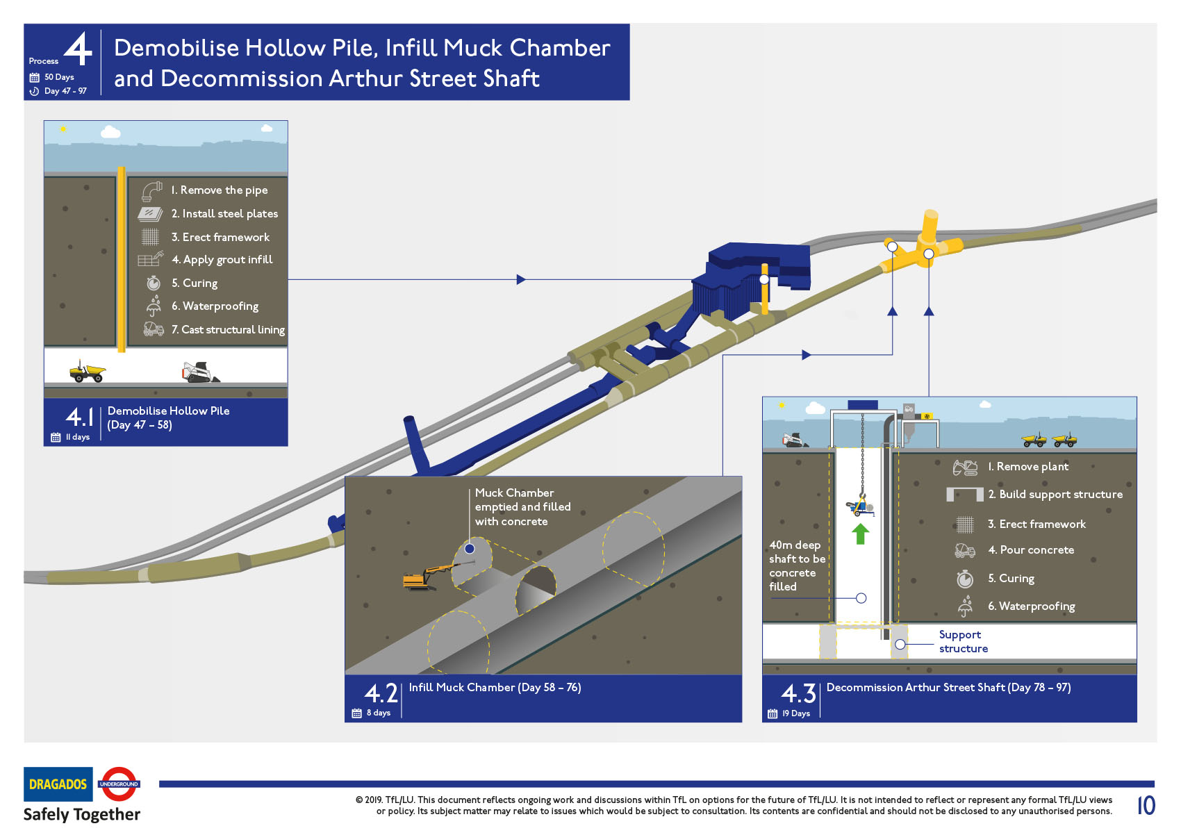
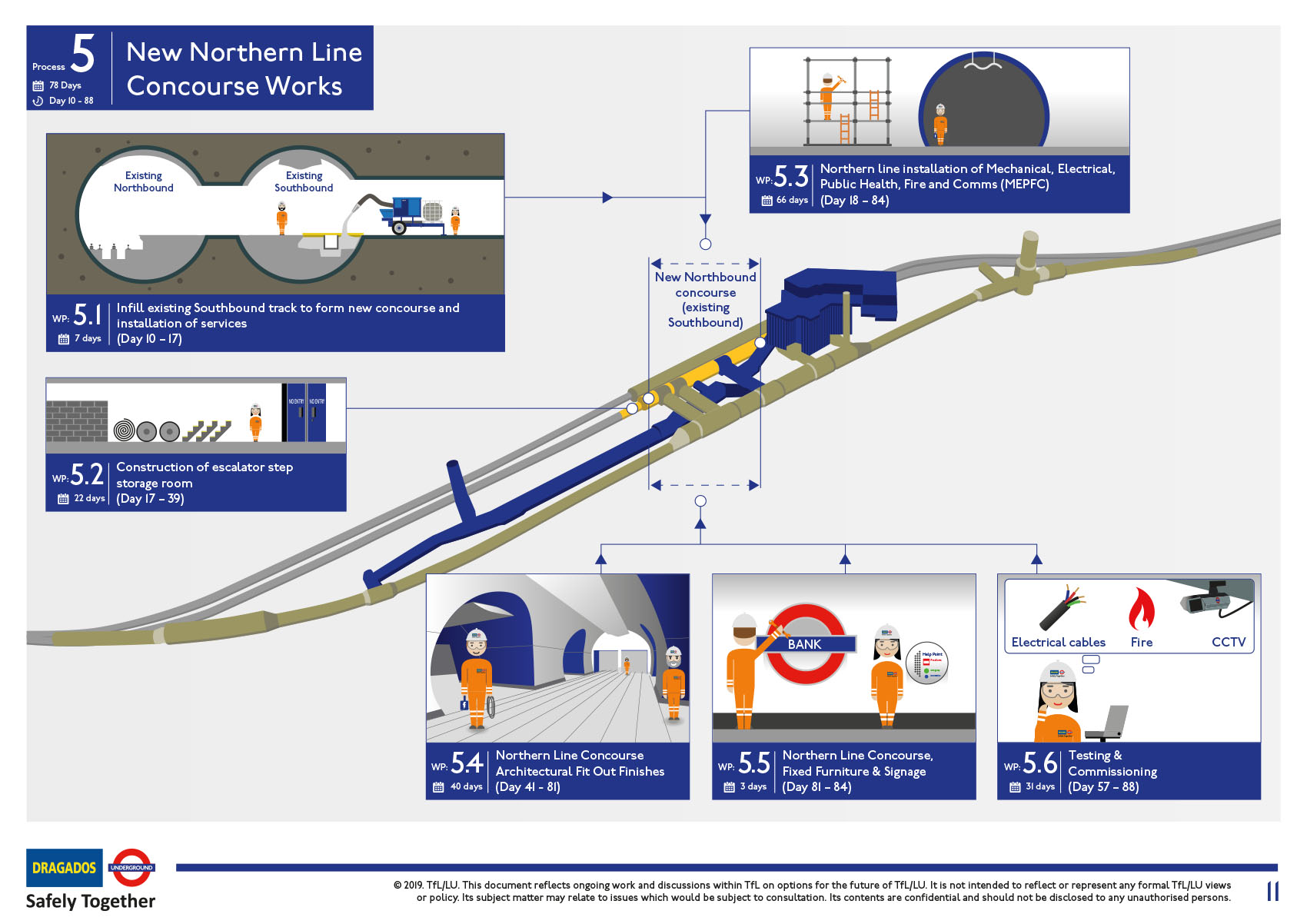
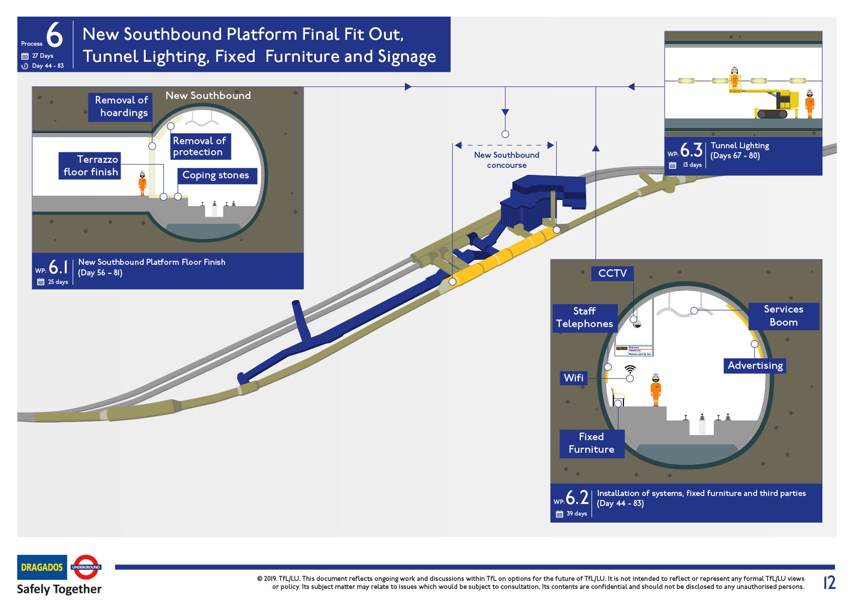
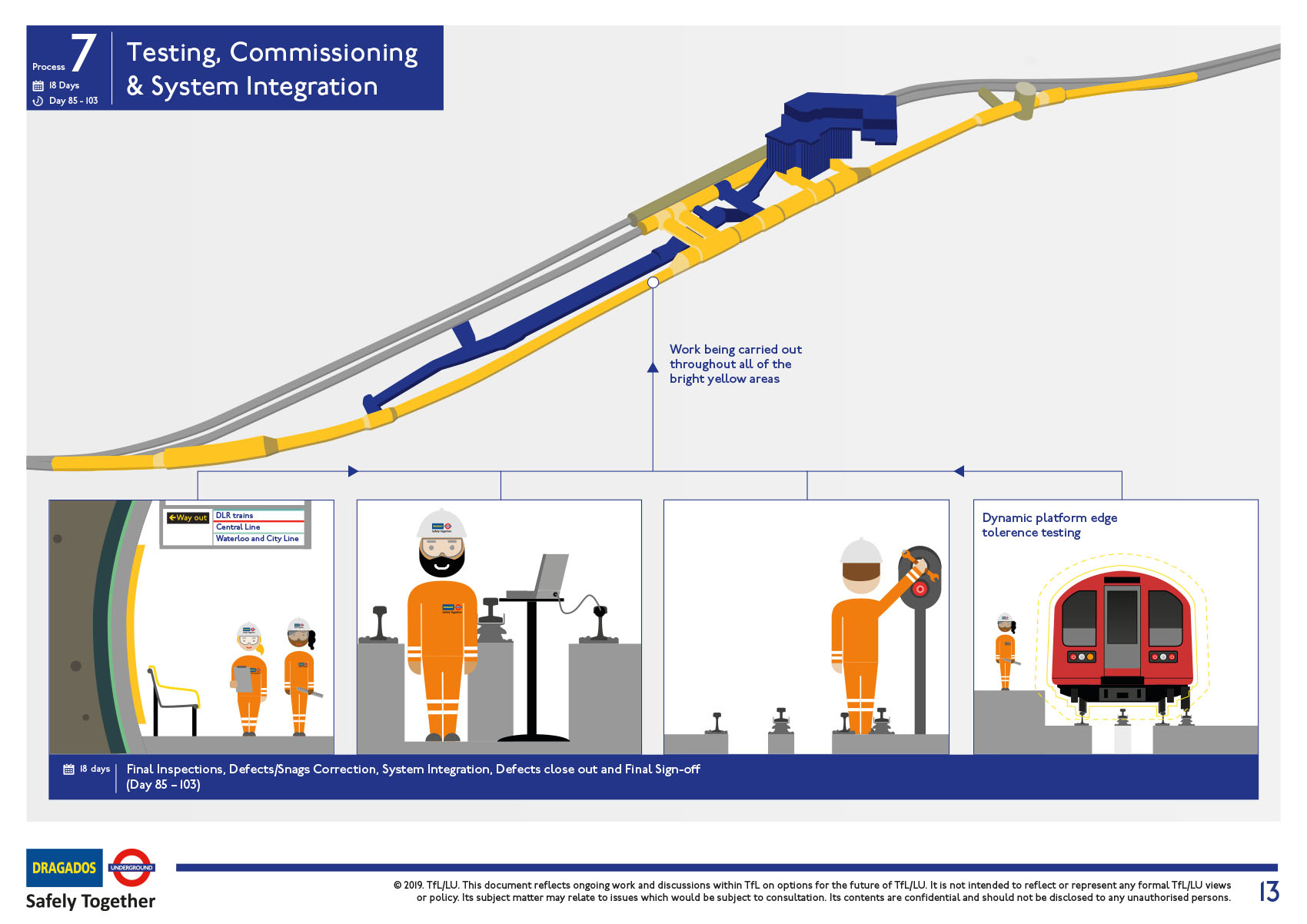
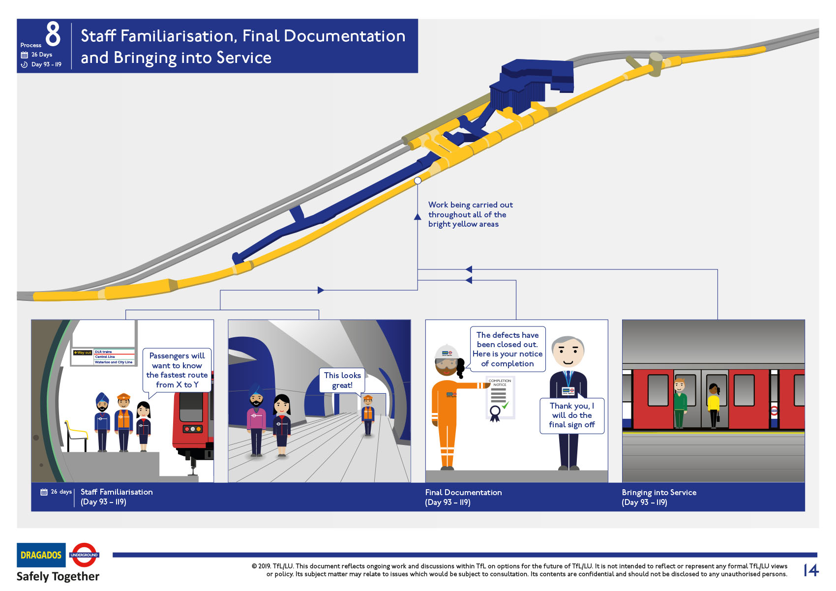
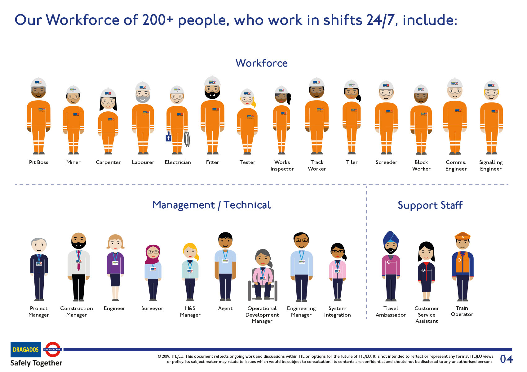
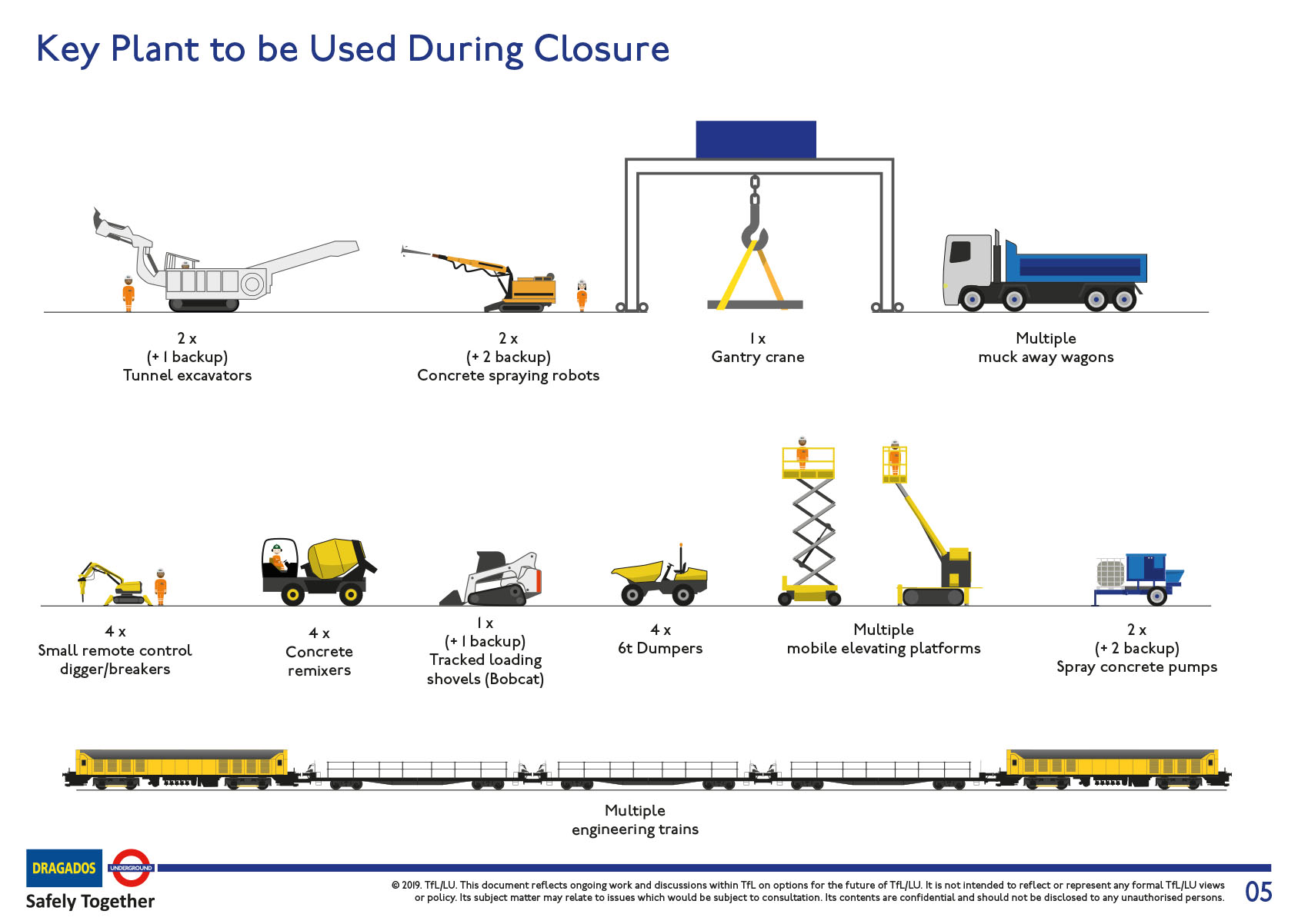
Development of a 15-page step-by-step Day In The Life Of (DITLO). This covered the eight key phases of the project, showed the timeline overlaps, and created a universally understood visual storyboard that the whole programme could get behind. Following on from this was the animation you see here which was used to simplify the complexity for TfL’s customers.
ANIMATION
At the end of the project, we compiled the DITLO and some of the architect’s concept visualisations into one video that was put on the external facing website. This was created to keep the general public up to date on the progress of the project.
“Their excellent visualisation skills have captured some extremely technical work processes and translated them into professional visual material. We will use this for high-level communications, both internally and externally. I would fully endorse and recommend their services to any company that is looking to simplify, or communicate, a message into wonderful graphics, illustrations and animations.”
Natalie Wood, Project Manager, TfL Bank Station Capacity Upgrade

Please note: The timescales that are included in the construction sequences were very high level and would not reflect accurately the time spent on each activity. This work was done in 2019, a few years in advance of the actual blockade (2022).
