
Railway Industry Association Office Branding
OFFICE BRANDING
Problem:
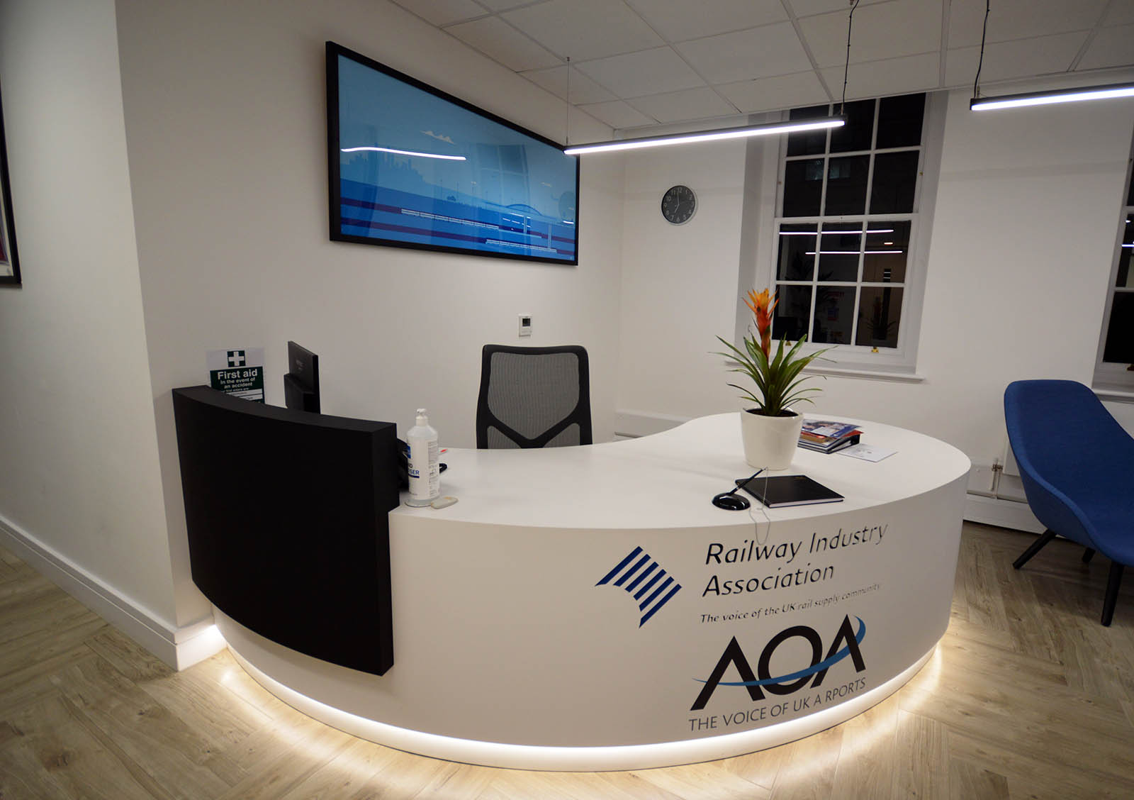
For the first time in half a century, the Railway Industry Association (RIA) has moved offices. Their new location is just a stone’s throw from Parliament, in Smith Square. For their office branding they wanted some timeless images that encapsulate the supply chain and what their members offer.
Visual Solution:
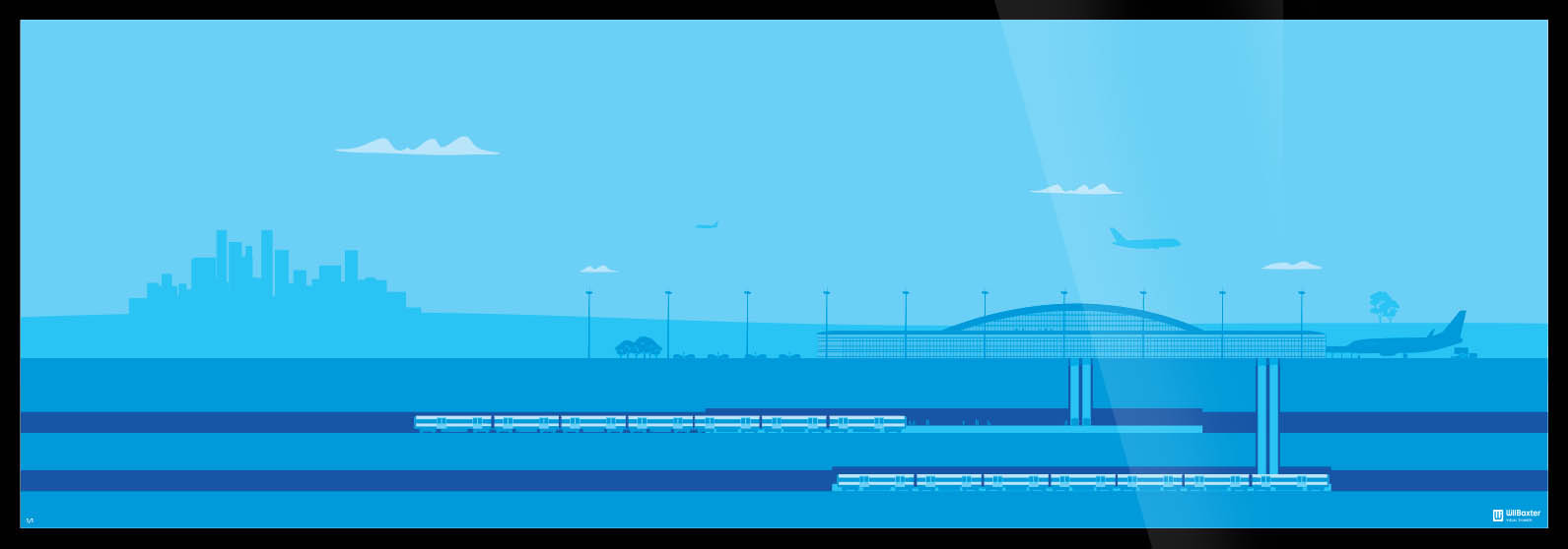
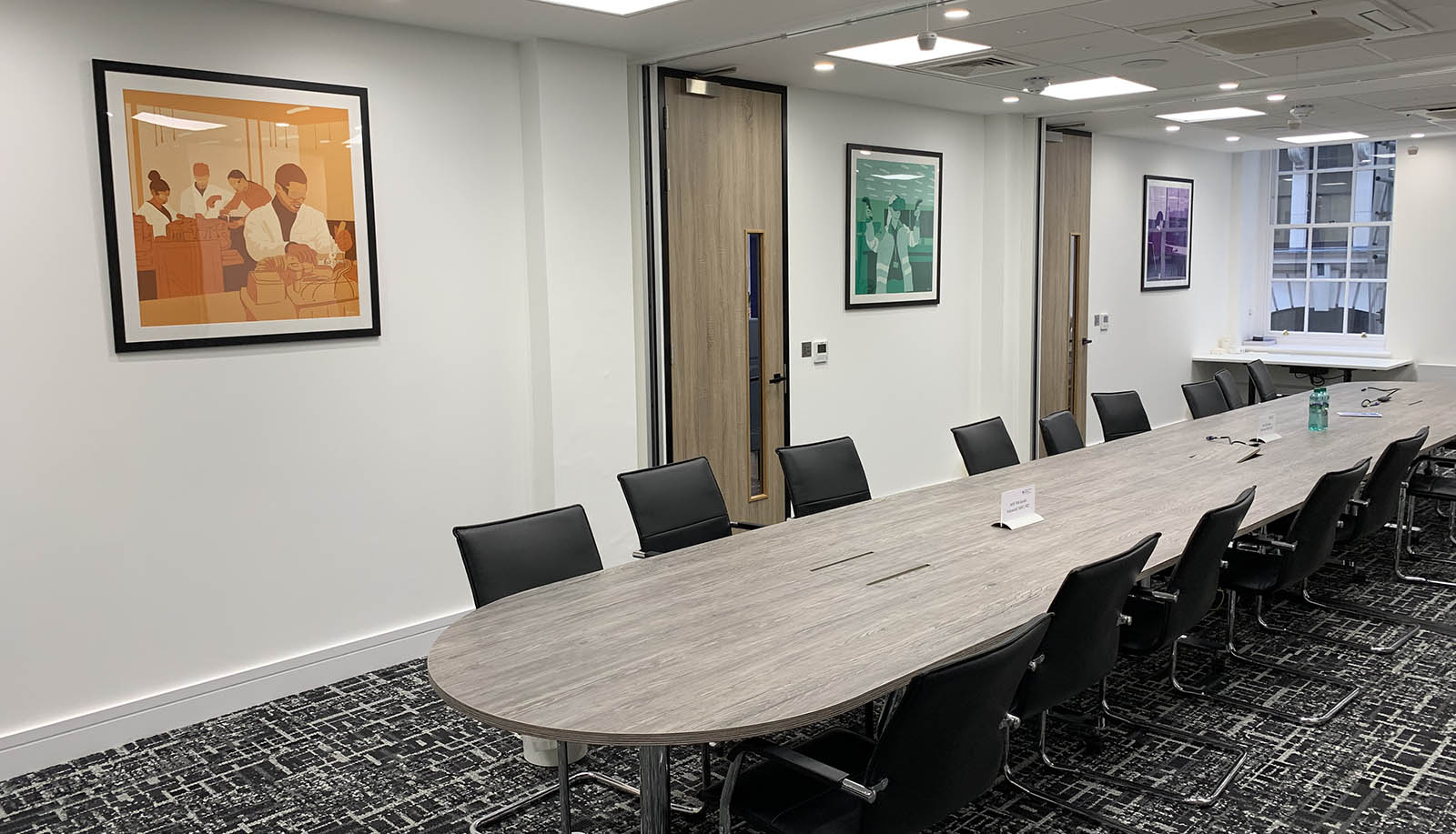
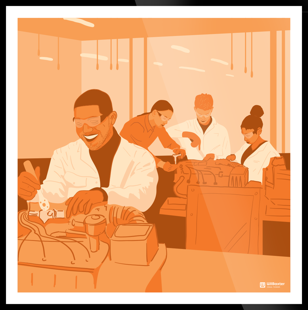
Working together with them we found 15 wall areas that could benefit from some life and then sectioned them into different image subjects. The reception area, which is shared with the Airport Operators Association (AOA), had a set of four generic rail and airport intersections. Their boardroom focused on people and innovation, with three illustrations of diverse young people working in engineering.
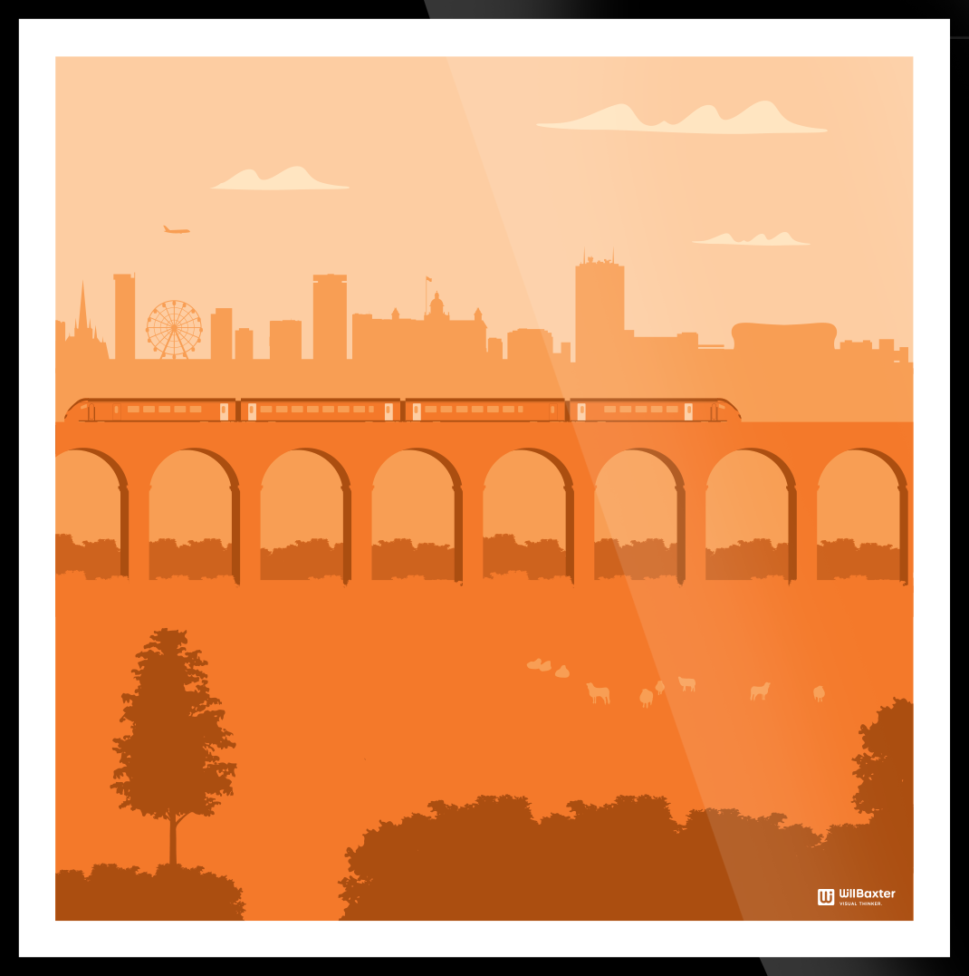
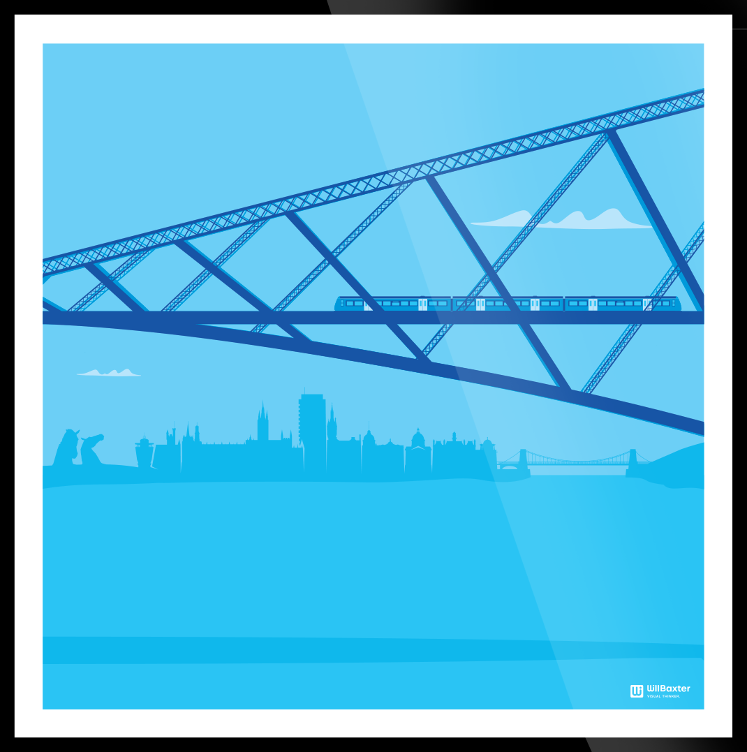
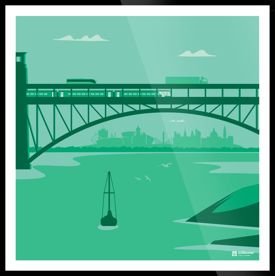
Finally, there were six images that reflected RIA’s six regions (Wales, Southern, Midlands, North, Scotland, and Northern Ireland). Within each of these illustrations, we showed a regional bridge and suitable rolling stock running over them. Once the artwork was approved, we managed the print, framing and installation providing the client with a one-stop shop for their office branding.
“Thanks for all your hard work on the project, the results of which have been well received by the team!”
Darren Caplan, Chief Executive, Railway Industry Association

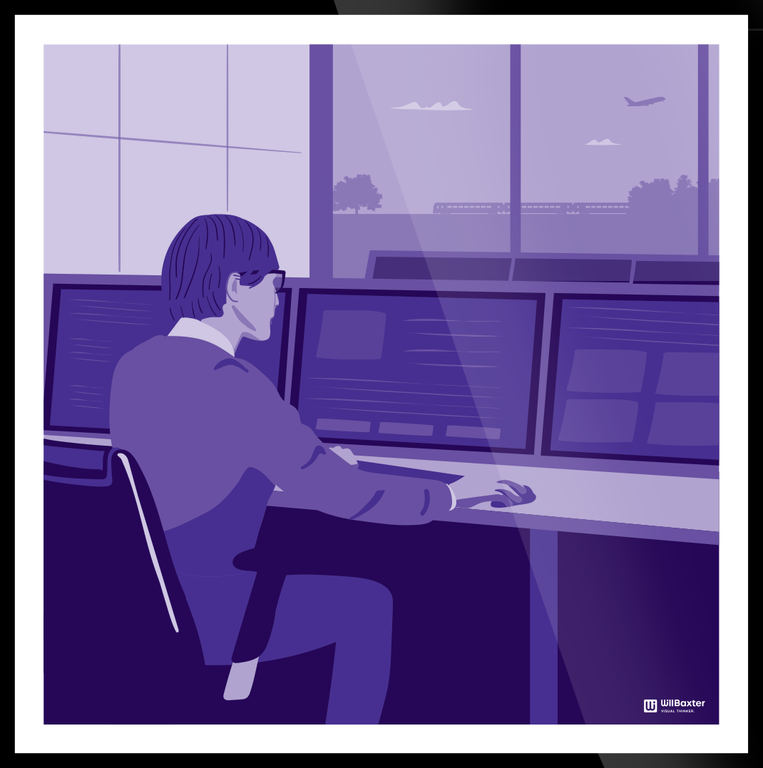
BOARD ROOM
Three bold designs which showcase modern areas of the rail industry. From young apprentices working on engines, to virtual reality training to a modern signalling room.
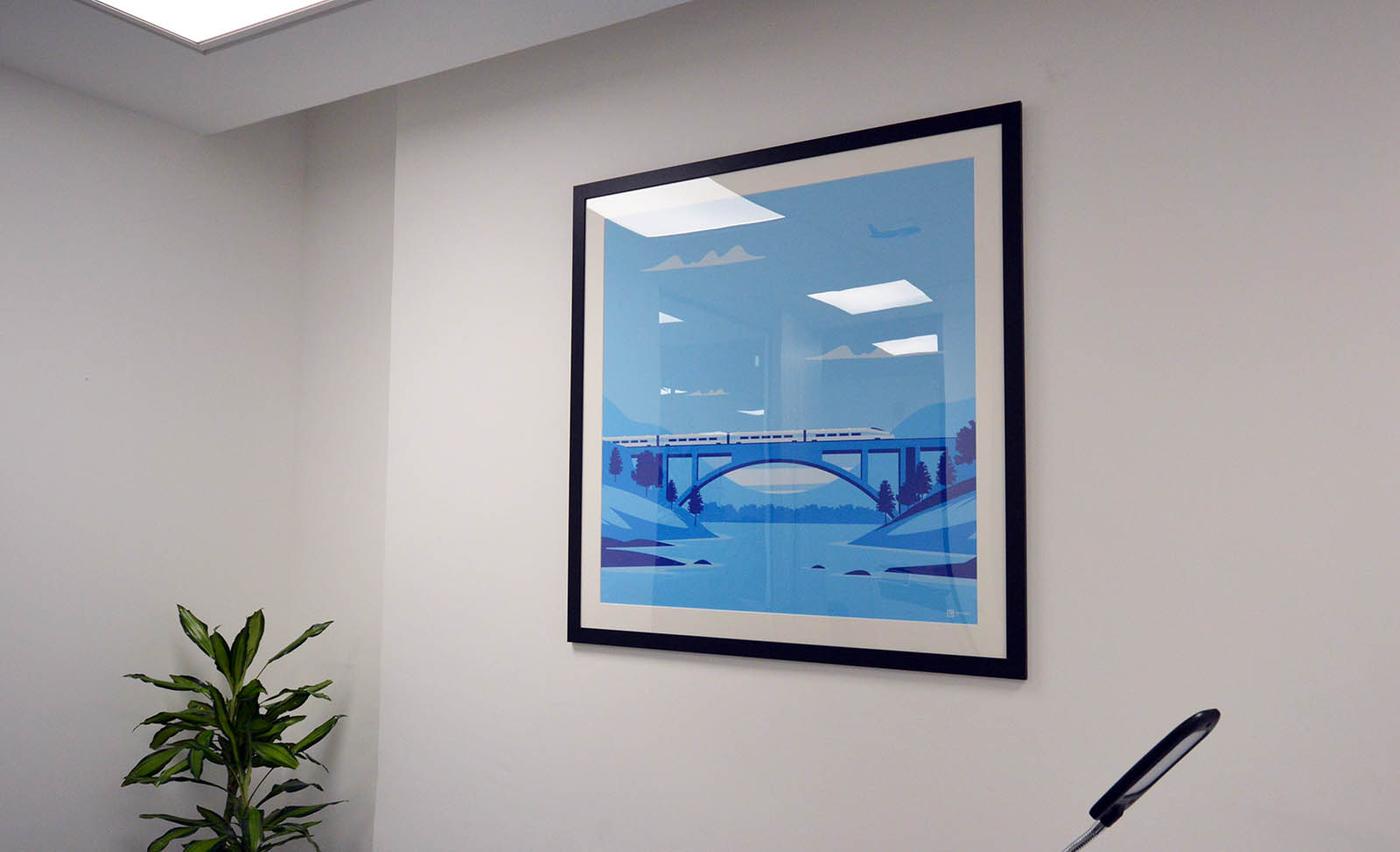
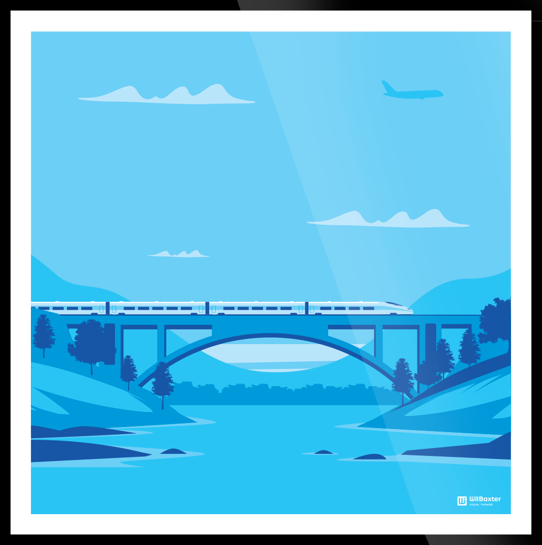
CHIEF EXEC’S OFFICE
This visual metaphor was specifically requested by the chief executive to show the bridge between RIA members and parliament.
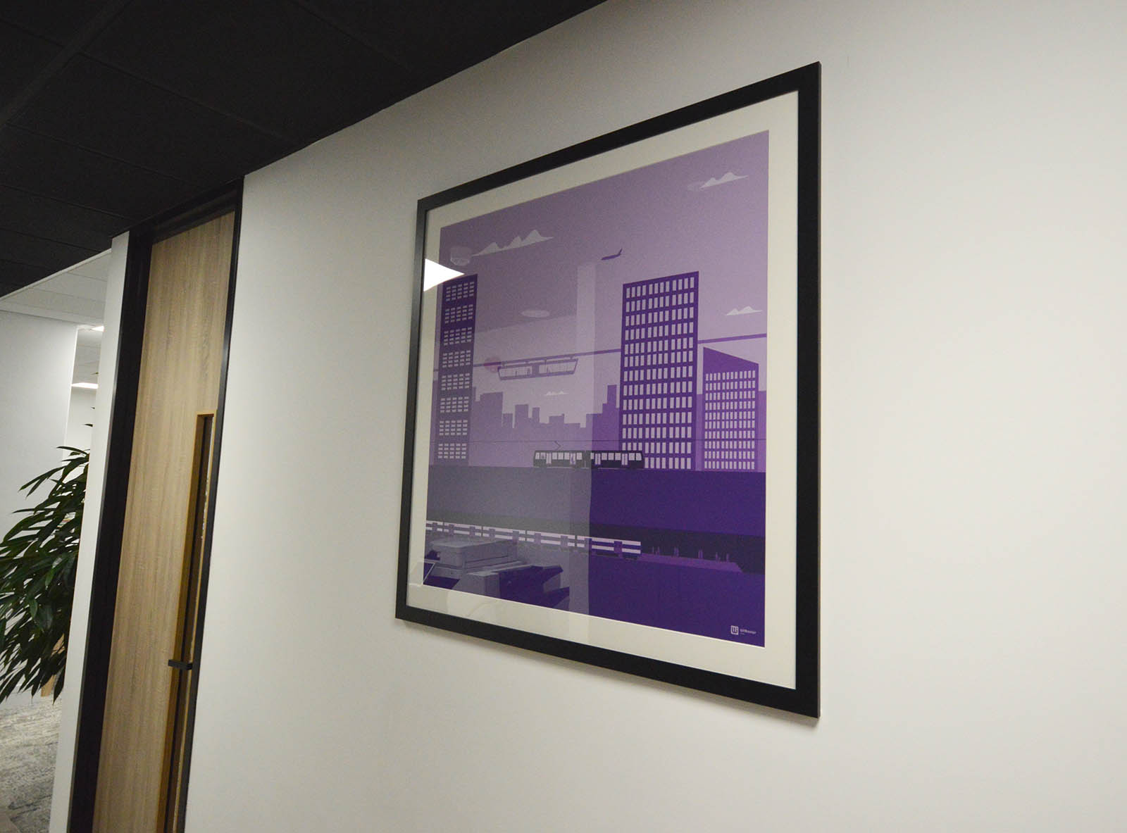
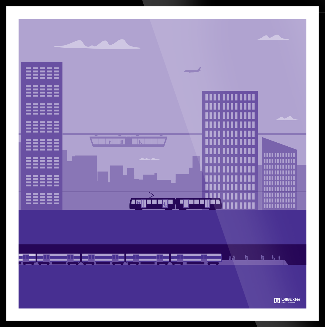
RECEPTION CORRIDOR
One of the first wall arts you see is this generic cityscape. It shows some of the layers of a modern city.
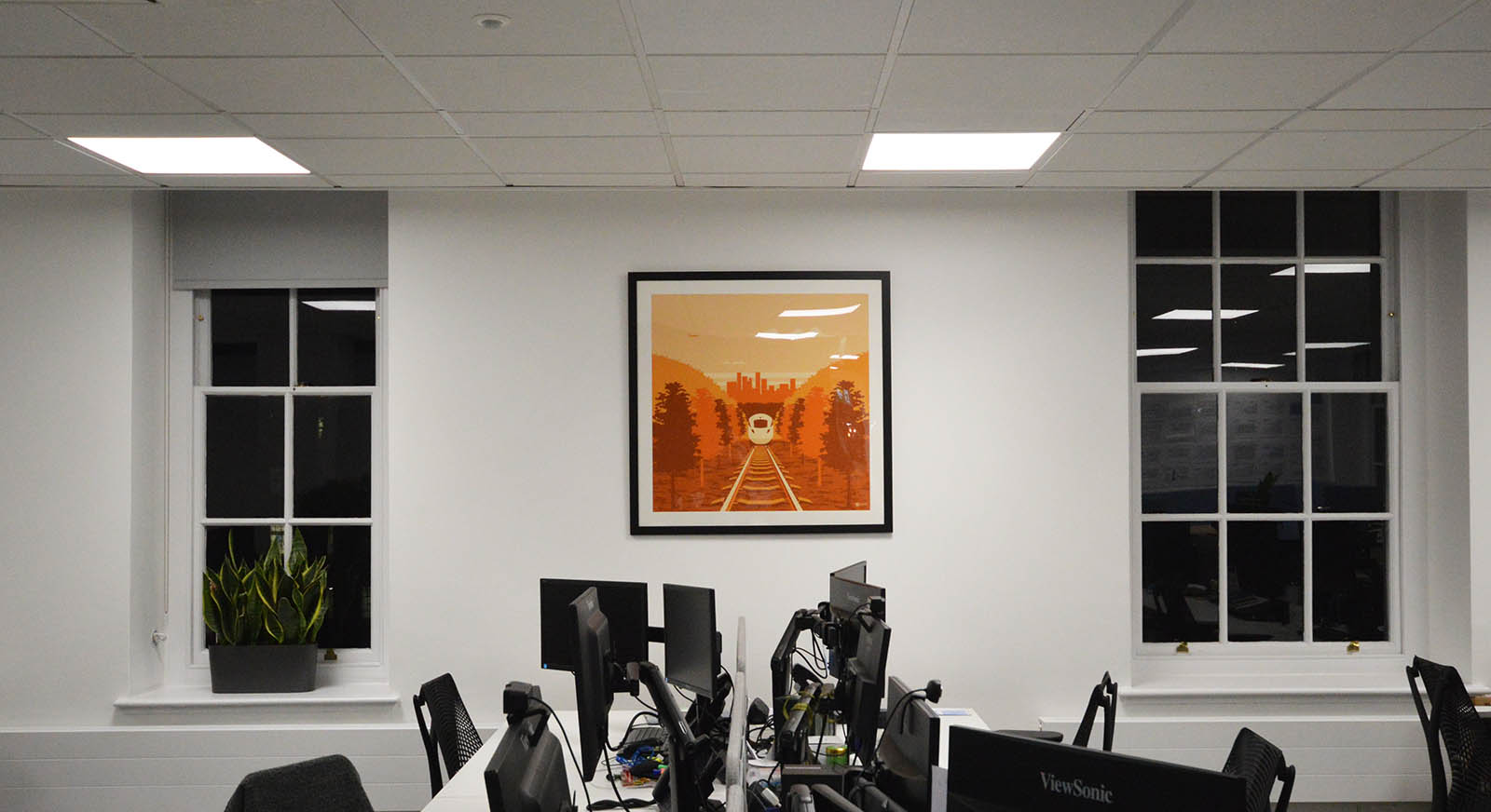
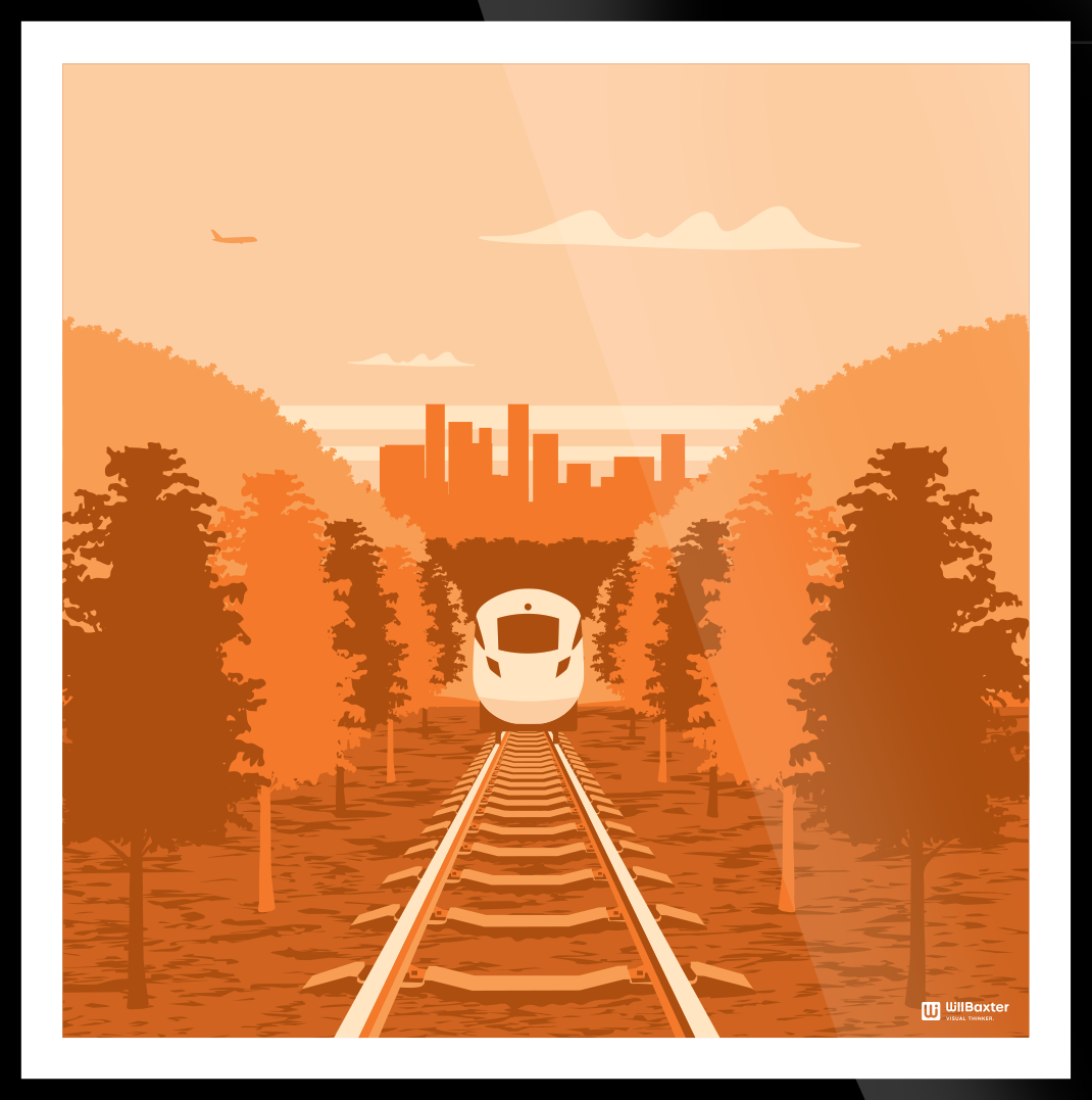
OPEN PLAN OFFICE
This vibrant design sits midway in the office and shows a generic high speed train travelling towards you. The idea is that it suggests dynamism and direction, two great traits in any employee!
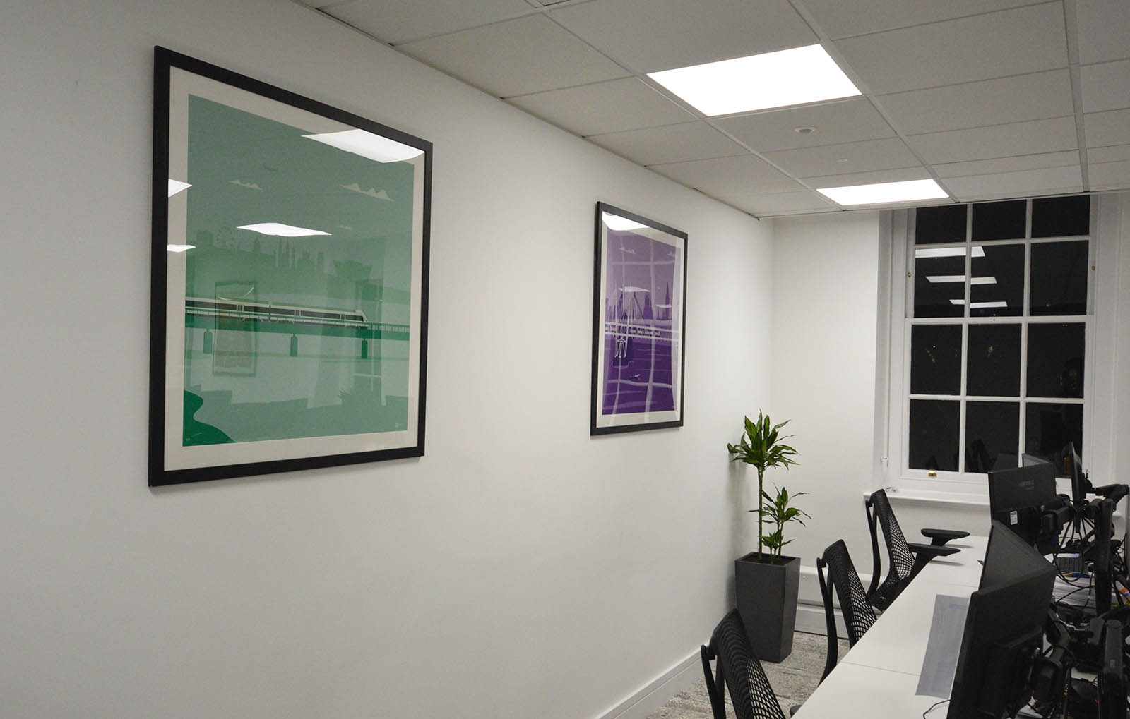
OPEN PLAN OFFICE
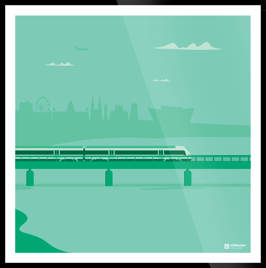
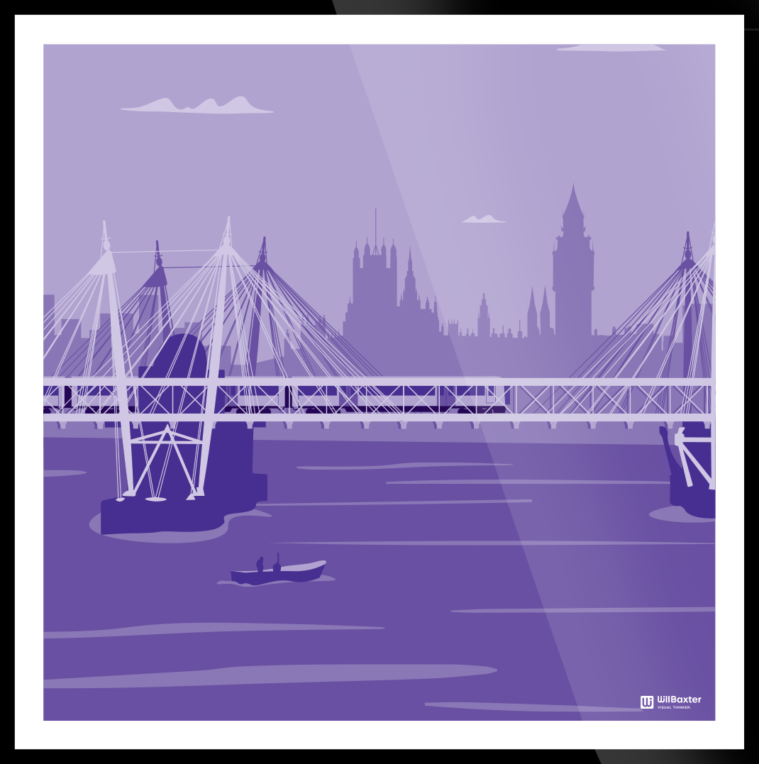
In the same room as the orange train are these two more relaxing images. They are two of the six part series which shows different parts of the UK. The green one is Northern Ireland, picking up on the Belfast skyline. The purple one is the Southern region, with London in particular.
MEETING ROOMS
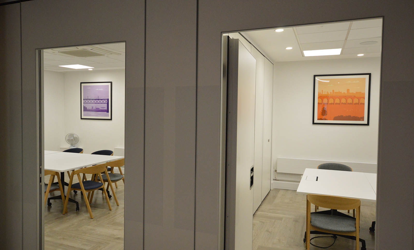
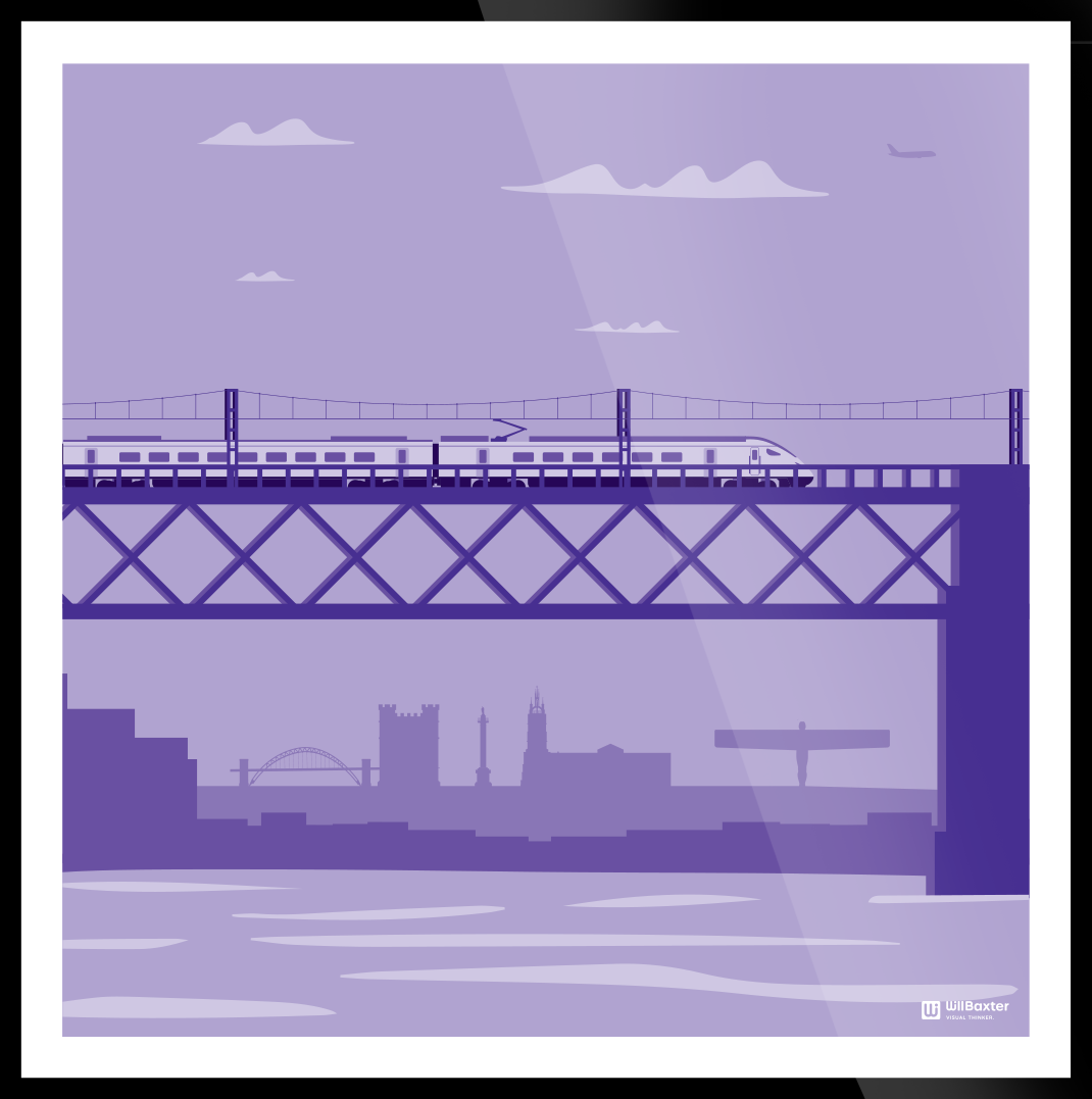
Continuing the bridge theme, we have two more regional designs. The purple one shows the high speed train in and the angle of the north. The orange is the Midlands, notable by the Selfridges building in the skyline.
THE HUB
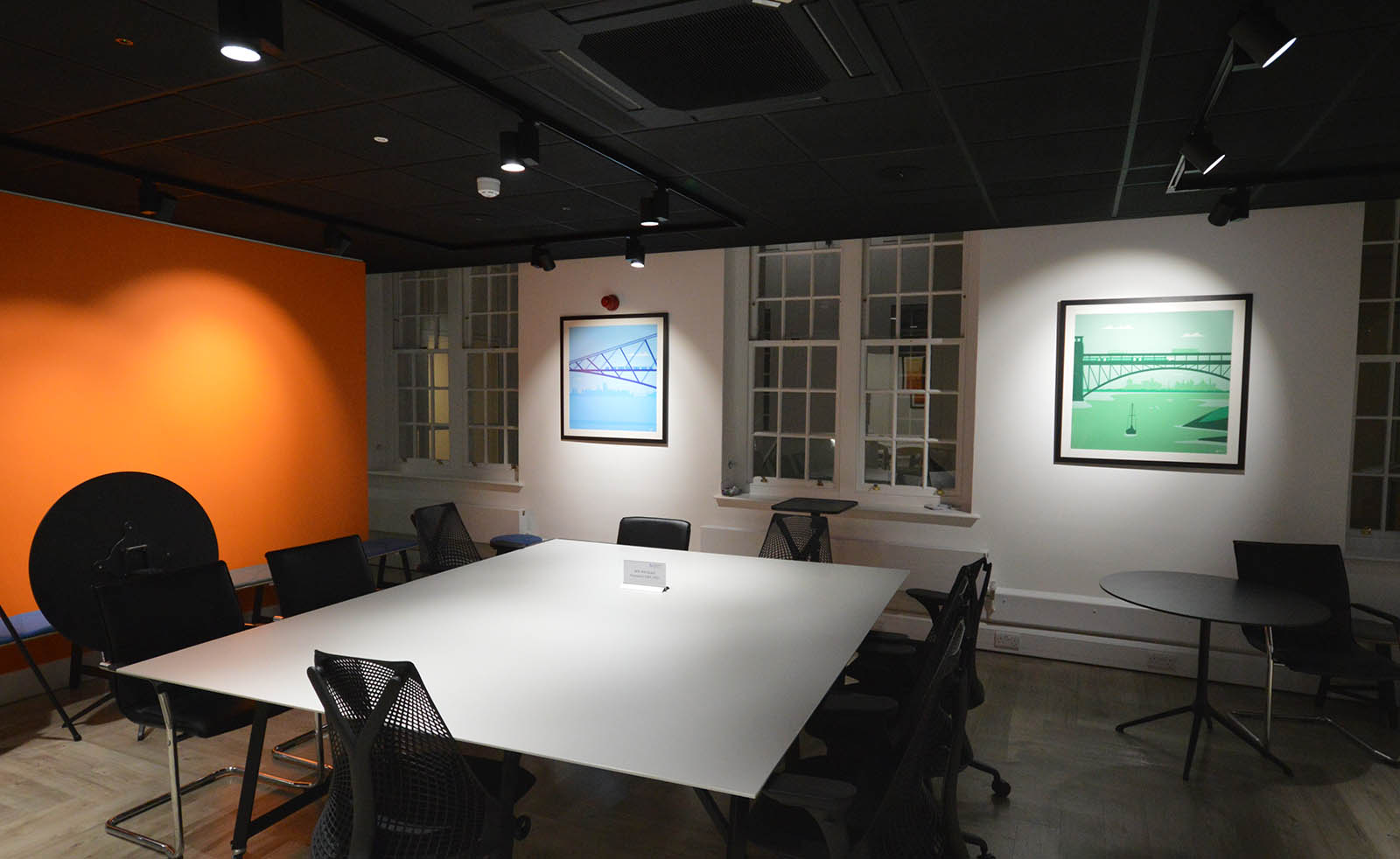
A conference area brought to life with bridges from Scotland (blue) and Wales (green).
